DESIGN BLOG
Thoughts
&
Musings
On Not Designing Josh
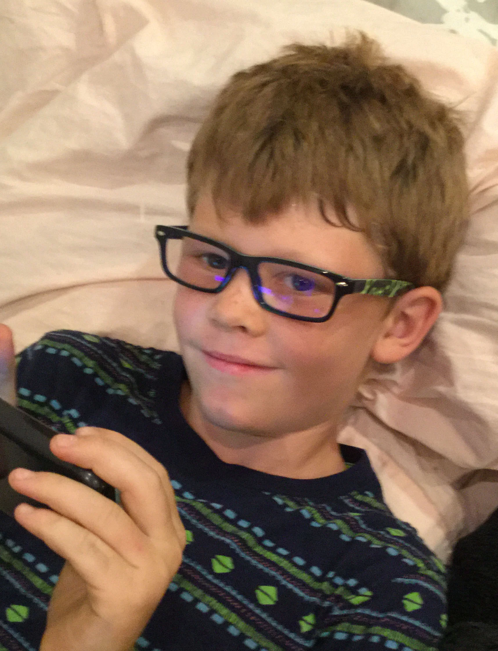
Josh looking content in his new specs
My husband Chris and I are artists. We have been making and designing throughout our decades long career. Our passion, hobbies, interests, conversations revolve around form, function, color and other artsy preoccupations. As a result, it is our lead foot in whether it's what we find something aesthetically pleasing.
On a routine eye exam at the office of the wonderful Dr.Moradi in Glendale we found out our 8-year-old son Joshua needed glasses. The trepidation Josh had about wearing them vanished when we pointed out that many scientists wore glasses. Being a scientist, along with becoming a stuntman, is one of his dreams.
After the exam, we all shuffled into the area where there were racks of frames just for kids. Edie, the lovely optician there, concentrated on presenting Josh with different styles. Chris and I pulled our choices from the shelves. Chris leant towards the subtle, almost frameless. I picked some that had a classic Harry Potter look. Plonking different spectacles on Josh's nose, he looked handsome but unimpressed. Edie sat right in front of Joshua and asked, "What do you like Joshua? Do you like light or dark frames?" "Dark!" he responded without hesitating. She reached for a pair of heavy rimmed glasses down with a splash of violent lime green on the sides. My husband and I both cringed. She put them on Joshua; he said "cool!"
I spoke first after Chris, and I threw each other sideward glances of horror. "Really? Josh, are you sure? Wouldn't you like...." Edie stopped me right there.
"Look," she said, "this is the first time that Joshua has smiled during this whole process. He knows what he likes; he knows what kids wear. If he doesn't like them, he won't be happy and won't wear them."
There and then it became instantly apparent to Chris and I that it was not about how we would like to see Josh but who Josh wanted to be.
After letting go and standing back, looking at his beautiful smile in those glasses, we understood that he had made a perfect choice. We saw Josh in a way we would have never imagined. We saw Josh the way he wanted to be.
Art, Color and More Art
How I design spaces with color as probably has a lot to do with my background as an artist. Conversely, I've noticed these different design projects for clients, the spaces themselves; creep back into my art work. Fascination with architectural form fuels the subject matter of my paintings, while the particular way I try to enhance environments comes from the way I understand spatial composition, color and proportion learned from studying painting.
One example is the home of one of my clients in Santa Monica. It's a beautiful contemporary three-story building with open space that lets light spill in from the third floor all the way to the first. As you look up the upper ceiling forms a sweeping curve and is clad with a warm tongue and groove wood. Sailing down back to the ground floor is a large flue that extracts the smoke from the fireplace. The upper two floors look onto the main living area with half walls that not only let the natural light everywhere but give the wonderful feeling of expansiveness; the same way you feel the open sky when you lean over the side of a ship.
I tried to enhance these qualities with color. Two elements in particular that nagged at me were the wonderful orange tone of the vaulted ceiling wasn't relating to anything of the same color family. It had no one to "speak" to. For the flue, I designed a custom color metallic copper paint. Instead of apologizing for itself when it was painted the same hue as the wall in back of it, it is now a proud feature in the room.
Back to painting, some of the feelings I try convey in my painting are the moments that you feel standing in a new space before you become "used to it". The time when you walk up a staircase for the first time with the anticipation of what you'll find at the top of the landing.
There was a a particular place on the second floor that struck me enough to do a painting. It was a place where all the different planes, some enhanced by different colors, converged. The contrast of the zig zagging perpendicular lines, the wood ceiling curving to make an arch on the tallest wall gave me a serene feeling mixed with exhilaration, I wanted to capture it in a painting.


