DESIGN BLOG
Thoughts
&
Musings
Making an Entrance in Los Angeles
My lovely client was changing her life and decided to move into a charming 1920s Spanish Cottage in Eagle Rock she had purchased as an investment rental 20 years ago.
One of the things that didn’t quite sit right with her was the absence of a formal entryway; the front door opened into the open-plan space.
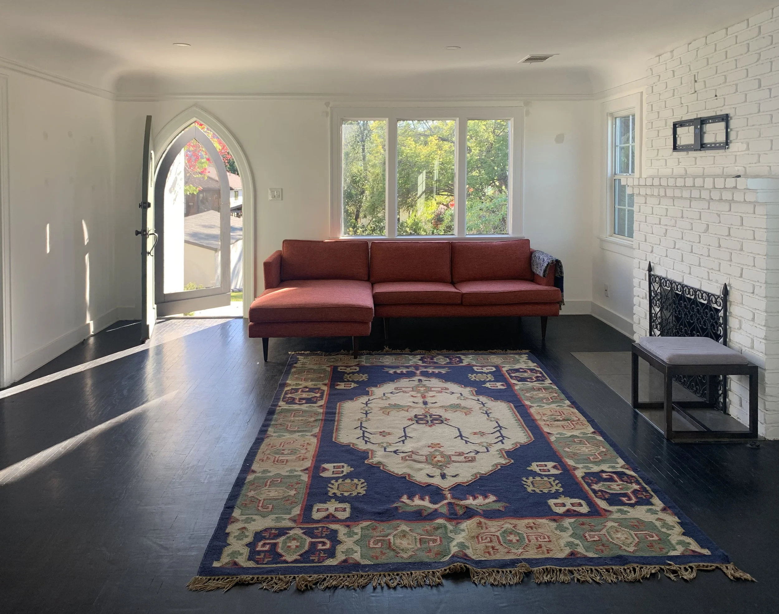
My client’s space before the construction of the room divider
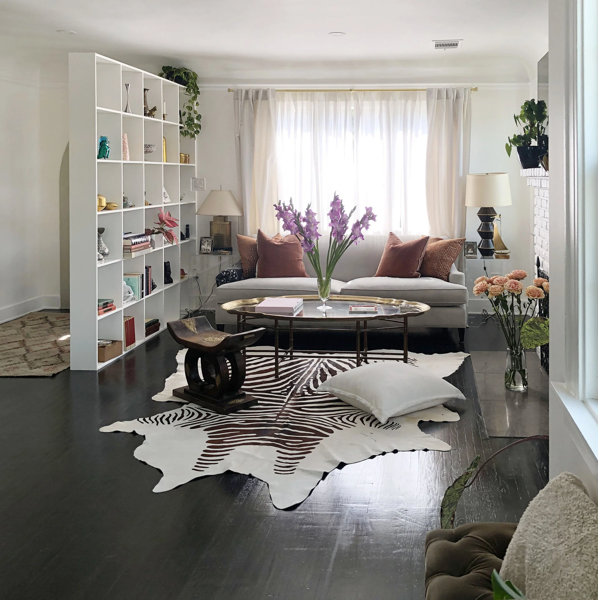
I proposed building an open shelving unit. My solution solved the problem; creating a faux foyer without losing natural light or making the front door area feel hemmed in. In addition, this open shelving gave my client a platform to stage her beloved collectibles gathered from world travels.
Contact me today to learn how I can help you transform your living space.
The new entryway; a transition space for putting your keys down and kicking your shoes off before settling in.
Art, Color and More Art
How I design spaces with color as probably has a lot to do with my background as an artist. Conversely, I've noticed these different design projects for clients, the spaces themselves; creep back into my art work. Fascination with architectural form fuels the subject matter of my paintings, while the particular way I try to enhance environments comes from the way I understand spatial composition, color and proportion learned from studying painting.
One example is the home of one of my clients in Santa Monica. It's a beautiful contemporary three-story building with open space that lets light spill in from the third floor all the way to the first. As you look up the upper ceiling forms a sweeping curve and is clad with a warm tongue and groove wood. Sailing down back to the ground floor is a large flue that extracts the smoke from the fireplace. The upper two floors look onto the main living area with half walls that not only let the natural light everywhere but give the wonderful feeling of expansiveness; the same way you feel the open sky when you lean over the side of a ship.
I tried to enhance these qualities with color. Two elements in particular that nagged at me were the wonderful orange tone of the vaulted ceiling wasn't relating to anything of the same color family. It had no one to "speak" to. For the flue, I designed a custom color metallic copper paint. Instead of apologizing for itself when it was painted the same hue as the wall in back of it, it is now a proud feature in the room.
Back to painting, some of the feelings I try convey in my painting are the moments that you feel standing in a new space before you become "used to it". The time when you walk up a staircase for the first time with the anticipation of what you'll find at the top of the landing.
There was a a particular place on the second floor that struck me enough to do a painting. It was a place where all the different planes, some enhanced by different colors, converged. The contrast of the zig zagging perpendicular lines, the wood ceiling curving to make an arch on the tallest wall gave me a serene feeling mixed with exhilaration, I wanted to capture it in a painting.


